In this post I'll tell about some details of character's inventory development.
Graphic style of item icons
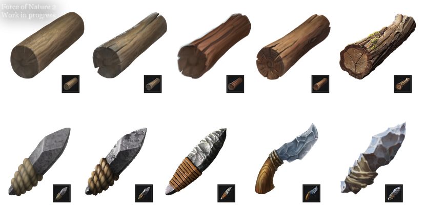
We've done a huge work to create our own style for item icons. Firstly, I wanted icons not to look soulless, as it often happens when using screenshots of 3D models of items. Secondly, I didn't want a high level of realism, as it was in the first part of the game (I took photos of real items for icons there). Thirdly, I didn't want to go to another extreme - cartoon-like images. Also, icons should be easily recognized in small size - you can draw a beautiful detailed object image, but when you reduce its size to fit into the inventory cell, all its details turn into an illegible chaos of pixels. In search of the needed style we tried many different ways of drawing the same objects.
We even made a table where we experimented with detailing, textures and shapes realism for a single object.
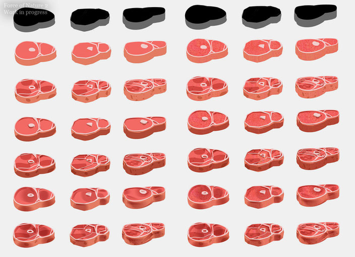
Finally we came to use a realistic shape, simplified details and stylized textures. I like the result. Icons look neither like cartoons, nor realistic or rendered. A close look will reveal the work of artist in each icon.
Inventory capacity
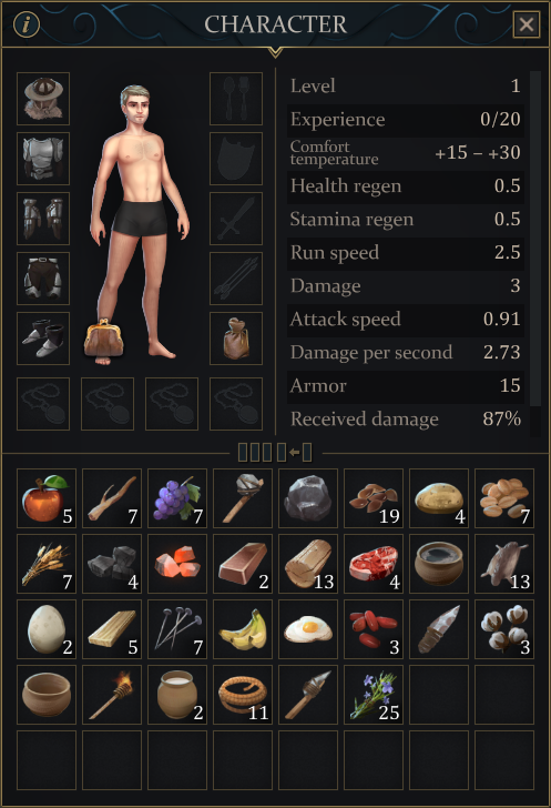
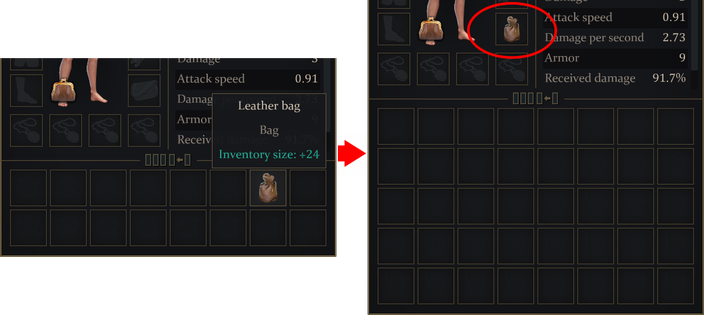
The capacity of your backpack will be quite small at the beginning of the game - only 16 cells. However, with time it can be increased by creating different bags.
Usability improvements
We've also added a few small changes that I hope will make life easier for players. For example, inventory compaction not only transfers all items to the upper-left corner now, but also groups them by class (food, weapons, resources, etc.). Sending items from the inventory to the chest (and vice versa) can be done now via mouse click with pressed Shift key.

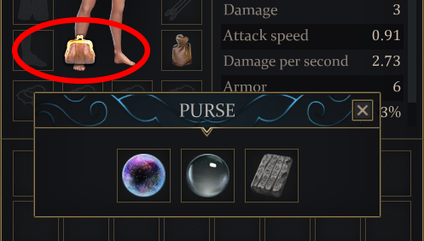
Important scenario items will now not fall into the backpack, but into a purse, from where they cannot be lost if you die.

Write a comment
Patrono (Saturday, 04 July 2020 13:54)
se tiver montarias e veiculos vai ficar show, perfeição nivel maximo.
severato (Sunday, 05 July 2020 22:14)
cool
Christian W (Thursday, 09 July 2020 02:54)
Looks great! I love how the items look, i love how the character looks too, inventory looks amazing, i spent so much time on force of nature 1 and now imagine how much time i will put in the 2nd part of the game.
Victoria (Monday, 13 July 2020 00:38)
Bought the first FON game for my little kids and I have to say it's really awesome. One of the Steam best purchases all year. Really looking forward to the new one!
Daniel (Monday, 13 July 2020 16:46)
A lot of hours of fun with my son playing on LAN with FON1.
I will buy this second part as soon as it is released!! We can´t wait!
Congratulations for this game
Voyteck (Monday, 13 July 2020 22:48)
This game will be epic! I played FoN 1 a lot :) Just let me buy it and play it already :D
SAm (Sunday, 06 December 2020 11:23)
It's nice if you add more cloth slots to directly select & change cloths as par situation.
Minimum 2 to maximum 3/5 slots are nice as par different cloths available in game.
For example: If we need worm cloths at some are then we only need to switch cloth slot to warm cloths & don't have to change every single cloth item one by one.