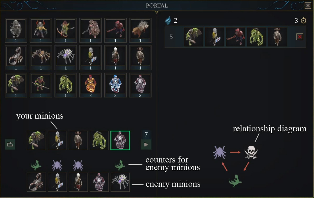
In the previous post, I discussed the need to make controlling the lane more convenient and to simplify base development. We first tackled the base-building aspect, which immediately had a positive impact on the gameplay for the builder role. Now, the next step is to make lane control more user-friendly and intuitive.
To recap, the most crucial aspect of controlling minions is that each race of minions has a specific race they "hate," so to speak, against which they deal double damage. If players can accurately predict the race of the enemy minions, they can send counter-race minions that will easily defeat them. However, in actual gameplay, lane battles often devolved into chaos, making it difficult to predict anything. As a result, no one really bothered trying to guess which minions the opponent would send next. To address this issue, we previously introduced a history of the last two enemy waves, but this feature provided little help. Often, these waves consisted of minions from different races, making it challenging to quickly figure out the right sequence of counter-races to deploy.
Visual Cues
To begin with, we decided to reduce the number of races in the cycle of minions that "hate" each other from four to three. With a cycle of four races, each race has one they counter, one that counters them, and one neutral race diametrically opposed in the circle. This creates too many relationships to keep track of. By reducing the cycle to three, we simplify it into a classic “rock-paper-scissors” format, where there are only three relationships to remember, making it much easier to grasp.
As a result, we completely removed orcs from the game, as they were the least interesting of all the minions. Among the remaining races, spiders counter skeletons, skeletons counter lizards, and lizards counter spiders. To make this relationship even easier to remember, we decided to visualize it and always display it as a helpful hint in the minion wave selection window, represented by a relationship diagram. But that’s not all. To further simplify the selection of minions for the next wave, we decided to show the composition of the enemy's last wave directly in the minion selection window. Additionally, above the heads of minions in the rival races, a visual cue now indicates which race should be selected to effectively counter that specific minion.
Assassin Minions
I’ve previously mentioned that melee minions were the least useful, and to make them more desirable, we gave them the ability to carry beneficial spells for the champion fighting on the lane. However, lately, we’ve been playing 1v1 matches as builders, which made this feature of melee minions less useful, once again raising concerns about their effectiveness.
To increase their value, we decided to change their behavior model. While these minions couldn’t stand out with high defense like tanks or attack from a safe distance like ranged units, they made up for it with smarter behavior. Melee minions now prioritize attacking the minions they "hate" most – the ones against whom they perform best. They can even bypass tanks to go after ranged enemies, who are particularly vulnerable to their attacks.
Minion Battle Map
With the composition and order of minions in each wave now playing a crucial role, balancing them became much more challenging. As I mentioned earlier, we recorded all our games so I could review and analyze the footage, making necessary adjustments. However, the problem was that the minion battles rarely appeared in the builder's field of view, making it difficult to assess whether our new mechanics were working as intended. To solve this issue, I decided to implement a mini-map of the minion battle in the corner of the screen that would always remain in the foreground.

On this map, each minion on the lane is represented by a small circle. The color and icon encode the minion's race and type. An outer ring indicates the minion's health, while an arrow extending from the circle shows which enemy it's currently attacking. Despite my efforts to simplify this visual representation as much as possible, it was still nearly impossible to interpret in real-time during gameplay. However, this wasn’t a major issue; during post-game analysis, I could pause, rewind the footage frame by frame, and closely examine any questionable battles.
Accelerating Base Construction
In addition to what was shown in the previous video, we also realized that there was no real benefit to having construction take a significant amount of time. Previously, because the builder had to spend extra time moving between the forest and the base, they would try to bring back as many resources as possible in one trip. However, now that this movement isn't necessary, the builder rarely accumulates surplus resources. As soon as the resources for the next structure are gathered, they’re immediately put to use. Consequently, the builder seldom multitasks. If the builder starts constructing something, it's usually to use it right away, and the 10-20 second build time began to feel like an unnecessary distraction. To stay productive, players had to switch to another task and then remember to come back to finish the first one. To eliminate this disruption, we decided to make construction nearly instantaneous, reducing the build time to just 1 second.
All these changes are demonstrated in the following video:
As always, we'll dive into the analysis next time.


Write a comment